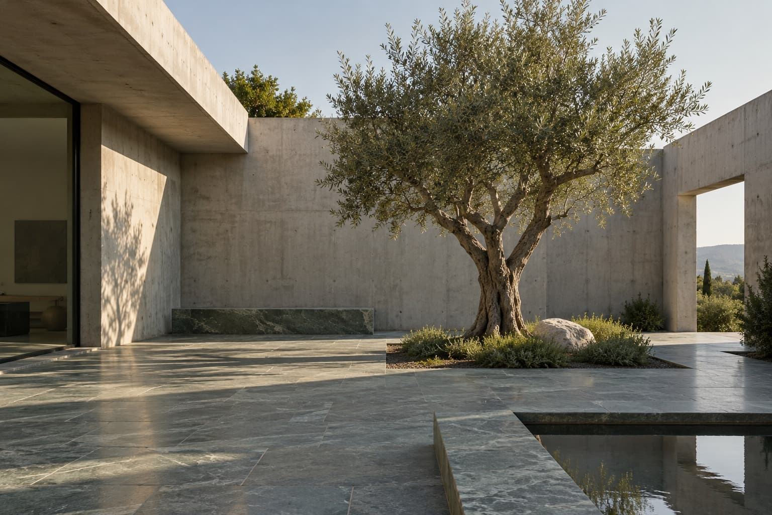
Living · House study
A private world organised around light, open air, and a moment of stillness.
2 min read
E · 5 / 26
Pages paced like a well-made magazine.
Robert Bringhurst puts a comfortable line at 45 to 75 characters, with 66 the ideal. The essay here is set to that.
Editorial design comes from the magazine, where an art director sets words and pictures for a reader who turns pages. Its unit is the spread, two facing pages seen as one. Its beat is the turn: an issue is a run of spreads, some loud and some quiet, and someone decides the order.
Alexey Brodovitch, art director of Harper’s Bazaar from 1934 to 1958, set the terms. He treated each spread as one composition of photograph, Bodoni and white space, cropped pictures hard and off centre, and paced an issue like a piece of music, changing size and weight from one spread to the next.
A screen has no page to turn, but the rest carries over. Text sits on a measure of 45 to 75 characters. Every piece keeps the same order: kicker, headline, standfirst, body, and a caption under each picture. Pictures are cropped for what they say. And the page is paced, a loud opener against long, quiet reading, with room left for a picture to land.
The studio’s online journal, read in a desktop browser. Browse the issue by section, open a piece and read it at your own size, save it for later, and look the work up in the project index.
Issue 07 · Autumn 2026
Six pieces on the open room at the middle of a house: who it is for, where the sun falls in it, and what it is made of.
Edited by Inês Moura
Living · House study
A private world organised around light, open air, and a moment of stillness.
2 min read
Living · Drawing
Ninety centimetres of roof, worked out from the latitude, keep the summer out of the courtyard house and let the winter all the way in.
2 min read
Gathering · Neighbourhood
An inviting shared space that makes connection feel natural.
2 min read
Gathering · Conversation
Clara Vidal and Rui Almeida, who founded FORMA, on why a room starts with where people sit, and the bench they keep on drawing.
2 min read
Retreat · House study
A restrained material palette that lets daily rituals take centre stage.
2 min read
Retreat · Material
Stone, lime, oak and water. Why the studio holds every house to four materials, and what the limit gives back.
2 min read
The parts the journal is built from: one deep-green button, fields on a hairline, kickers and captions in the grotesk, and square corners throughout. Rows of states hold still for comparison; everything else works.
The rooms sit on three sides of it, one room deep, so every room has the court on one side and a garden wall on the other.
Page 5 of 16.
The courtyard house2 min
Where the sun falls2 min
Living · House studyA private world organised around light, open air, and a moment of stillness.
Words by Inês Moura2 min readStep 3 of 5. Read twice: once for sense, once for length.
A flatplan is the whole issue on one sheet, sixteen pages laid out as spreads, so an editor can see its pace before anything is made. Each spread is loud or quiet. Move them about, by drag or with the keys; the line beneath draws the rhythm, and a note says when three loud ones run together or the text runs on without a breath.
The pace is good: no three loud or three quiet spreads run together
Opener “The courtyard house”, pages 4–5
Drag a spread to move it, or choose one and move it with Earlier and Later. With the keys, Space or Enter picks up the spread in focus, ← and → move it, Space or Enter puts it down, and Esc puts it back where it was.
Ten colours with their contrast, one serif in two optical sizes and its italic, a grotesk for the small print, a measure, a 28px baseline and the space it divides into, and three speeds. Copy them as custom properties, with the standfirst, the drop cap and the caption.
| Role | Size / leading | Line |
|---|---|---|
| Headline | 40–64 / 1.06 | Two or three lines, never more |
| Standfirst | 21 / 28 | About 50 characters |
| Text | 18 / 28 | 66 characters, never past 75 |
| Sidenote | 14 / 21 | About 35 characters |
| Caption | 13 / 21 | The width of its picture |
Sizes in pixels. Text and standfirst share the 28px baseline; captions and sidenotes sit on three quarters of it.
:root {
  /* Paper and ink */
  --paper: #eff0ea;
  --sheet: #f8f8f4;
  --wash: #e3e6dd;
  --rule: #a7b3a2; /* lines only, never type */
  --ink: #25372c;
  --ink-2: #55625a;

  /* FORMA green, and what sits with it */
  --green: #263b2d;
  --pale: #edf2e7;
  --mark: #dde5cf;
  --proof: #9a3b26;

  /* Type */
  --font-serif: 'Newsreader', Georgia, serif;
  --font-sans: 'Schibsted Grotesk', system-ui, sans-serif;
  --measure: 27.5em; /* about 66 characters of text */

  /* A 28px baseline, spaced in quarters */
  --baseline: 28px;
  --space-1: 7px;
  --space-2: 14px;
  --space-3: 21px;
  --space-4: 28px;
  --space-5: 42px;
  --space-6: 56px;
  --space-7: 84px;
  --space-8: 112px;

  /* Edges: hairlines and square corners */
  --hairline: 1px solid var(--rule);
  --radius: 0;

  /* Motion */
  --turn: 600ms cubic-bezier(0.65, 0, 0.35, 1);
  --settle: 900ms cubic-bezier(0.16, 1, 0.3, 1);
  --mark-in: 180ms ease-out;
}

/* The italic sentence between headline and text */
.standfirst {
  font-family: var(--font-serif);
  font-style: italic;
  font-size: 21px;
  line-height: var(--baseline);
  max-width: 20em; /* about 50 characters */
}

/* A drop cap three lines deep, sunk into the text */
.dropcap::first-letter {
  -webkit-initial-letter: 3;
  initial-letter: 3;
  margin-right: 0.12em;
  font-variation-settings: 'opsz' 72;
  color: var(--green);
}
@supports not ((initial-letter: 1) or (-webkit-initial-letter: 1)) {
  .dropcap::first-letter {
    float: left;
    margin: 0.06em 0.1em 0 0;
    font-size: 3.5em;
    line-height: 0.8;
  }
}

/* Every picture says what it is, underneath */
.caption {
  font-family: var(--font-sans);
  font-size: 13px;
  line-height: 21px;
  color: var(--ink-2);
}Where the style shows up outside this page.