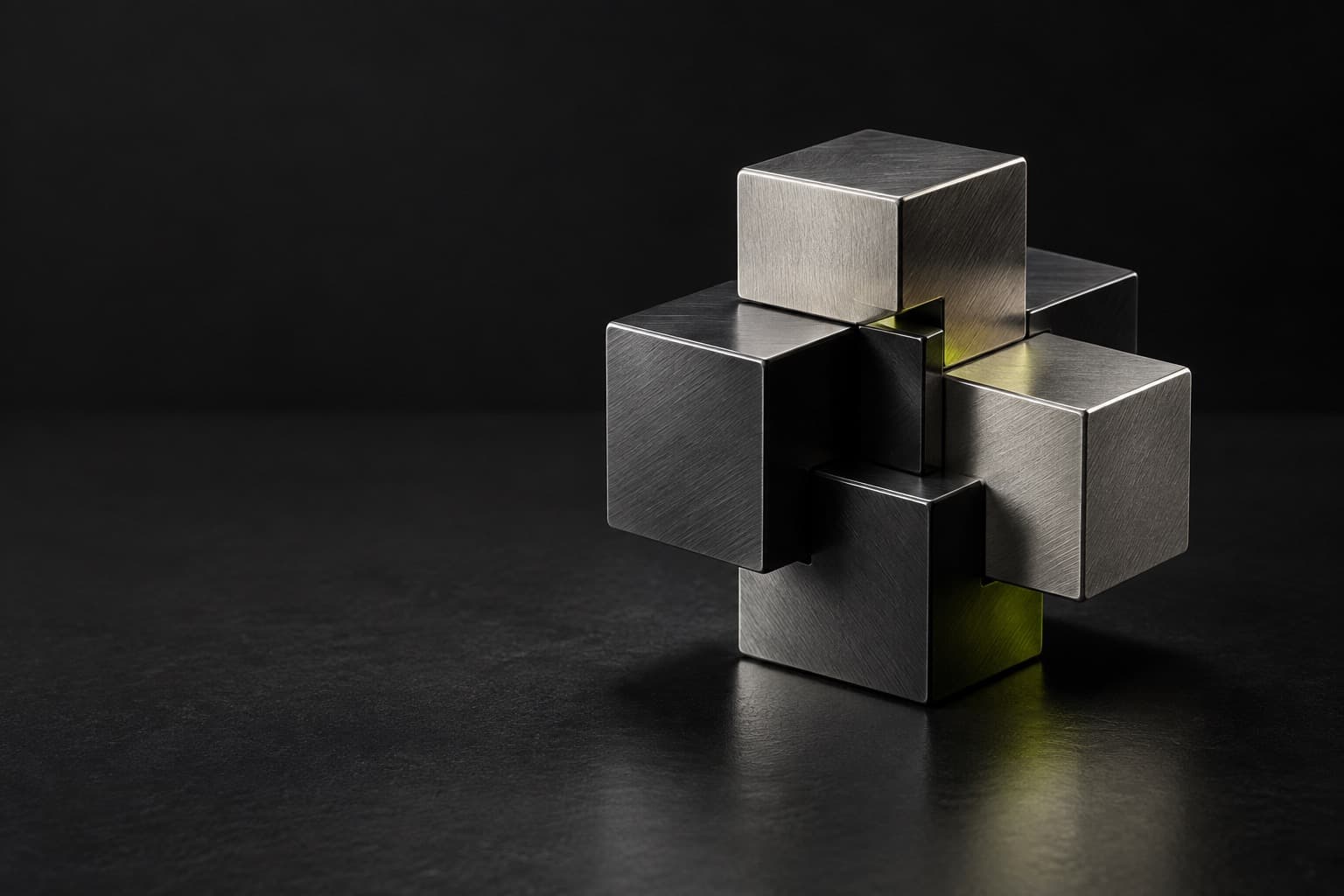
Steel, in two inks
Proof 3 · uncoated · 500 copies
D · 4 / 26
Any image, two inks.
Duotone began on the press. A photograph is screened into halftone dots twice and printed from two plates in two inks, classically black and one colour, so a single image gains a depth or a tint that one ink cannot give. Photo books and posters have used it for generations.
Around 2015 it came back on screens, and louder. The second ink stopped being a quiet warm grey and turned electric: blue against pink, green against violet. Spotify’s 2015 Year in Music campaign, built on the identity the studio Collins made for the brand, is the example most often cited.
The method is simple. Drop the colour, keep the tone, then map the darkest pixels to one ink and the lightest to the other. Here that is an SVG filter: a feColorMatrix makes the picture grey, a feComponentTransfer spreads the greys between two inks. It makes unrelated pictures belong together, as our own screens do below. It fails when the pair has no contrast, or when text sits on the picture without a solid ground.

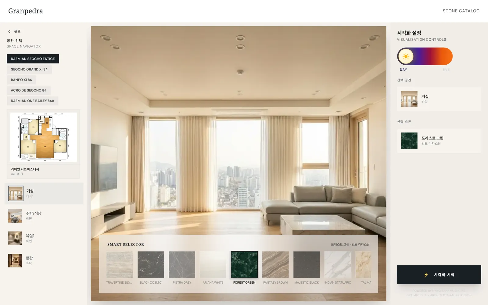
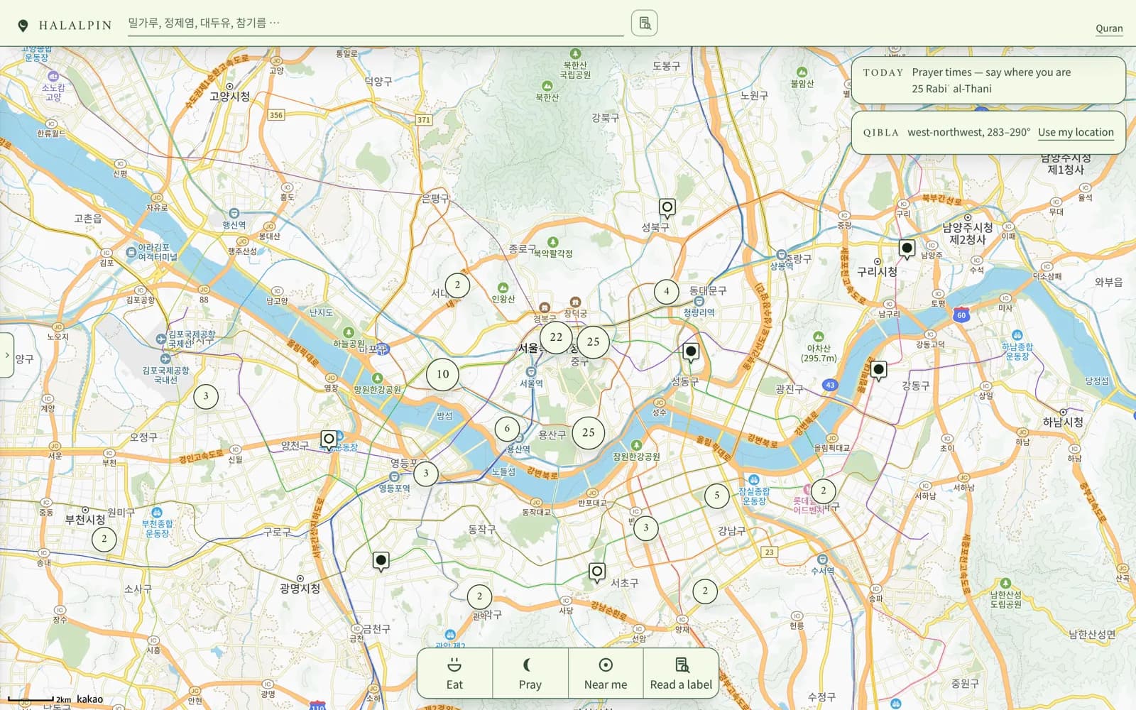

A playlist screen, working: pick a mix and the whole screen re-inks, covers included. Play, skip, shuffle and save all work.
Late, slow, mostly synths · 5 songs, 20 min
Three things to print with: the dark ink, the light ink and the paper. Chosen is the dark ink set solid; the light ink is a plate printed 4px off register. Switch the inks above and the kit follows.


Both plates, as the press will print them.
Proof 3 · uncoated · 500 copies
Drop a photograph, pick a pair or mix two inks, and download the result as a PNG. It all runs on a canvas in your browser; nothing is uploaded.
Every picture on the page is stacked once per pair. Switch the pair and the layers cross-fade; the type re-inks with them.
:root {
  --paper: #f5f2ec;
  --black: #121216; /* text on the light ink */

  /* The pair. Swap both together, never one. */
  --ink-shadow: #1b1fdc;
  --ink-light: #ff5ea8;
  /* or Green / Violet: #00603f / #b98cff */
  /* or Navy / Orange: #14215e / #ff8a2b */

  --rule: 2px solid var(--ink-shadow);
  --plate: 4px 4px 0 var(--ink-light);
  --focus: 3px solid var(--ink-shadow);
  --focus-offset: 4px;
  --radius: 0;
  --space-1: 4px;
  --space-2: 8px;
  --space-3: 12px;
  --space-4: 16px;
  --space-5: 24px;
  --space-6: 32px;
  --space-7: 48px;
}

/* Pictures: an inline SVG filter does the inking.
   <filter id="duotone" color-interpolation-filters="sRGB">
     <feColorMatrix type="saturate" values="0" />
     <feComponentTransfer>
       <feFuncR type="table" tableValues="shadow-r light-r" />
       <feFuncG type="table" tableValues="shadow-g light-g" />
       <feFuncB type="table" tableValues="shadow-b light-b" />
     </feComponentTransfer>
   </filter> */
.duotone {
  filter: contrast(1.2) url(#duotone);
}
Violet and pink, 1.6:1 apart. The picture turns to mush: no shadow, no highlight, just a tint.
Over the light areas it vanishes, over the dark ones it shouts. Give it the paper or a solid ink instead.
Four pictures in four pairs. The set falls apart, which is the one thing duotone was there to stop.
Where the style shows up outside this page.